
Info Design: How to architect your info products
I’ve learned this the stupid way—
You can build a product people need and still watch it die in their inbox like a lonely Google Doc.
And even though I oversimplified making info products in the Info Product 101 guide, messy content isn’t quirky—it’s conversion cancer.
I learned this during my sabbatical, when I dissected dozens of “value-packed” creator products—most failed not from lack of genius, but from lack of structure. Not enough friction to drop, but not enough clarity to stick.
Let’s not get it twisted: content isn’t king.
Flow is.
Without intelligent info product structure, you’re just throwing spaghetti at the LMS wall and praying for transformation.
So if your completion rates suck harder than a corporate webinar or you’re still winging your “curriculum design for creators” based on Notion templates and vibes—this is the piece that hands you the surgical knife.
We’re slicing through fluff and opening up the learning experience design behind products that not only teach—but tattoo themselves into memory.
So buckle up, things are about to get weird.
- 🧃 Stop Winging It: Why Structure is the First Scalpel
- 🧩 The 3 Layers of Info Design Most Creators Miss
- 🏗️ INTRODUCING: The S.C.A.F.F.O.L.D. Method
- 🧪 Case Breakdown: An eBook That Actually Worked
- ⚠️ Common Structural Crimes in Info Products
- 🛠️ Tactical Blueprint: How to Audit Your Info Product Like a Damn Architect
- 🧨 The Best Info Product Is the One They Actually Finish
🧃 Stop Winging It: Why Structure is the First Scalpel
Let’s kill the sacred cow early:
“Just teach what you know” is a cargo cult strategy.
Sure, it feels authentic. But so does a street preacher shouting truth with zero audience.
The result? A beautiful brain dump.
With a drop-off cliff sharper than a MrBeast thumbnail graph.
“Value ≠ Retention. Structure = Retention.”
— Everyone’s backend analytics, probably.
The problem isn’t that your lessons aren’t valuable.
It’s that your learners don’t know how or when that value shows up. It’s also one of the few reasons creators end up building the wrong type of info products.
Welcome to the Information Disappointment Curve.
It looks like this:
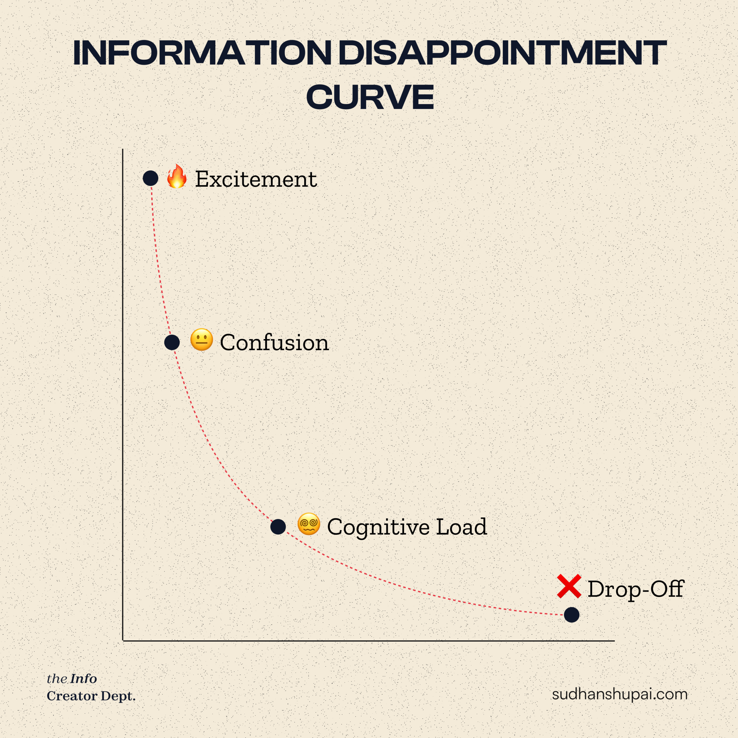
Courses that lack effective content flow tend to front-load theory, misplace practical wins, and ignore pacing completely. In self-paced environments, this is a death sentence.
This isn’t just bad UX. It’s economic leakage.
Every dropout is a lost referral, refund risk, and retention black hole.
So before you obsess over price, scarcity, or design—
build a spine.
Your content isn’t the product.
The transformation path is.
🧩 The 3 Layers of Info Design Most Creators Miss
Let me say it straight: “Value” is a marketing word. Structure is the product.
And yet, most info products are built like badly renovated Airbnbs—cluttered, gorgeous on the surface, and fundamentally unlivable.
During my sabbatical, I reverse-engineered dozens of successful and… less-than-successful courses from indie creators to 7-figure operators. What emerged was a disturbing pattern:
Most creators are designing their content like it’s a vibe.
Not a conversion mechanism.
They start with “stuff I know,” pile it into modules, slap on a progress bar, and pray to the Kajabi gods.
But if your content doesn’t have a nested structure, you’re designing a knowledge maze, not a transformation engine.
See also: The Content to IA shift.
The problem isn’t lack of knowledge.
It’s lack of cognitive architecture.
Here’s the skeleton behind the magic 👇
🧱 1. Macro Layer – Offer-Level Progression
The “Act I, II, III” of Your Product’s Movie
Think of this as your course’s economic model of transformation.
Each module = a phase in the customer’s Value Accrual Journey.
If your offer doesn’t have a macro-arc, it’s like binge-watching Netflix out of order. Confusing. Frustrating. Forgettable.
“When people don’t know what stage they’re in, they assume they’re lost.”
— From my notes, helping creators in my burnout hell.
And this isn’t just anecdotal. According to Learning Scientists Dr. Barbara Oakley and Dr. Richard Mayer, structured sequencing of content increases comprehension by 28–42% in self-directed environments. (Source: Mayer’s 12 Principles of Multimedia Learning)
At the macro level, you’re not teaching.
You’re reframing identity.
A creator enters as X and exits as Y. This layer needs to reflect that hero’s journey.
If your product can’t be plotted like a story arc, you’re just selling well-dressed Google Docs.
🔄 2. Meso Layer – Inside Each Module
The cognitive flow of lessons: don’t drop the dopamine
Here’s where things collapse.
You think the hard part is making slides. It’s not.
It’s knowing what not to include.
This is where most creators confuse “more” with “better”—but more content = more dropout.
What you need is meso-level sequencing: how ideas evolve from one lesson to the next like a dopamine breadcrumb trail.
“Attention is a currency. Poor sequencing is hyperinflation.”
— Behavioral Economist Dan Ariely (paraphrased, but he’d agree)
Use what’s called the Cognitive Flow Pyramid:
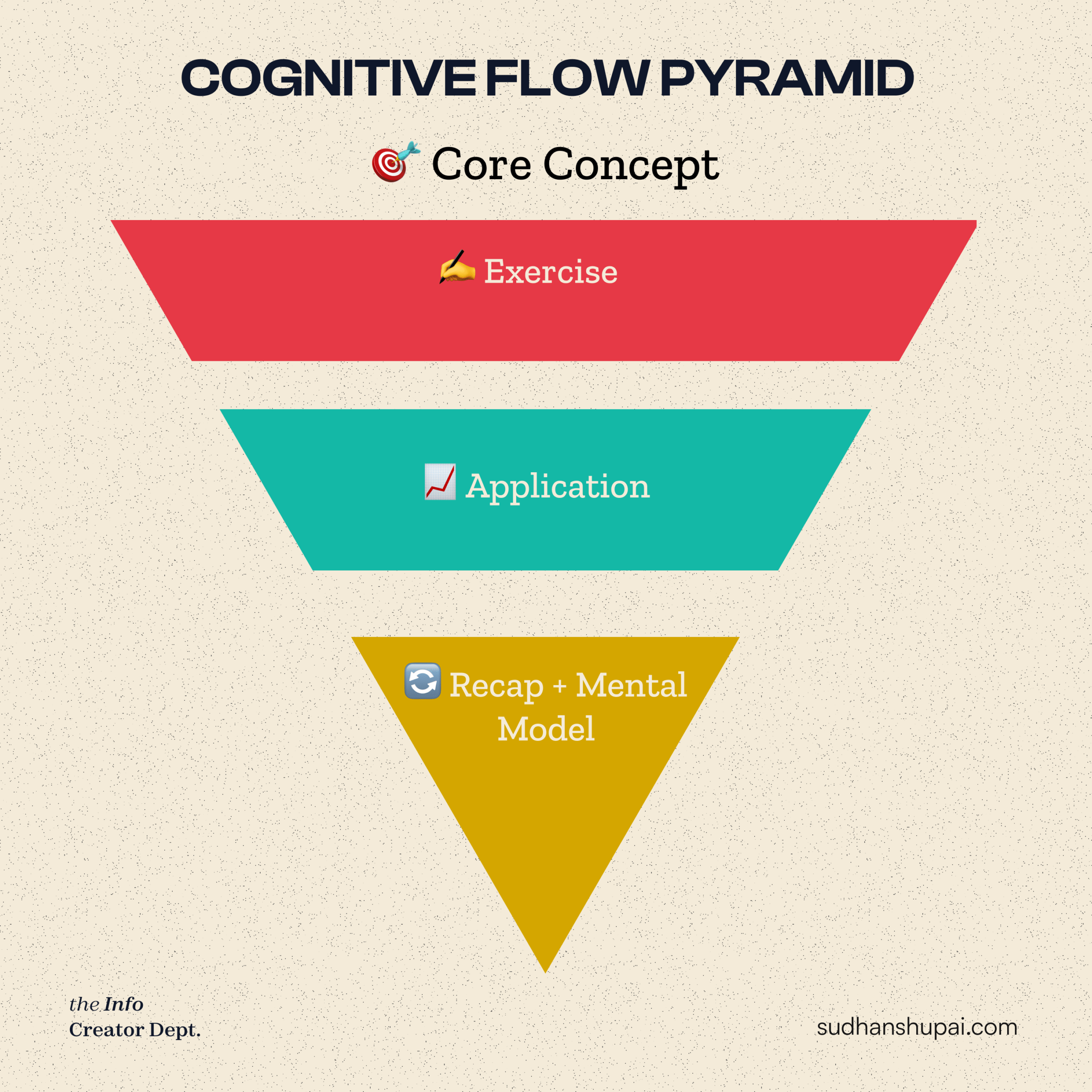
Each lesson should end with either a WIN or a REFRAME. Otherwise? They’re not learning. They’re consuming.
And consumption doesn’t pay dividends.
🧬 3. Micro Layer – Inside a Single Lesson
This is where trust is built or lost
Now we zoom in.
You have 2 minutes to prove you’re not wasting their time.
The Micro Layer is about intra-lesson flow—and this is where cognitive overload quietly kills retention.
According to Mayer’s principles (again), things like modality, signaling, and redundancy reduce friction and increase retention dramatically.
Let’s simplify this with a table:
| Micro Design Principle | Bad Example 🧟♂️ | Good Example 🚀 |
| Split Attention | Text + diagram competing | Diagram narrated clearly |
| No Signposting | Random transitions | “First, let’s tackle X…” |
| Wall of Text | Paragraphs on screen | Visual breakdowns + highlights |
Every lesson should move like a song:
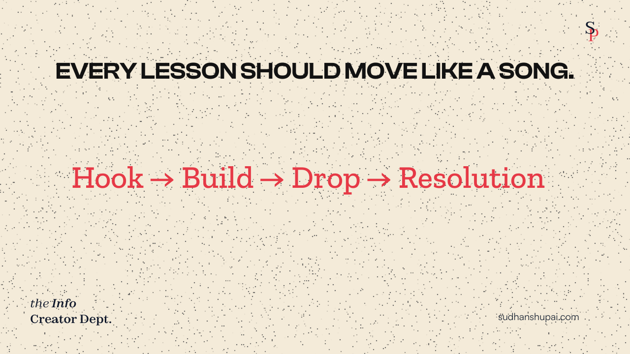
Because if the brain can’t follow, the brain won’t care.
And if they don’t care, they don’t click “Next.”
💡 The Invisible ROI of Structure
Think this is overkill? Then you’re missing the bigger game:
Structured content = scalable transformation.
- You retain more students
- You get better testimonials
- You unlock referral loops
- You reduce refund risk
- You increase LTV per buyer without adding extra videos
In creator economics, structure = compounding trust.
Which brings us to a system I’ve been testing: a modular, fractal-inspired structure that can scale with any content type.
But first…
🏗️ INTRODUCING: The S.C.A.F.F.O.L.D. Method
The Anti-Course Method to Stop Losing Students After Module 2
Somewhere between the 5th unread Notion doc and the 42nd Loom video sitting on your desktop like digital debt… something snapped.
And if you’re like me (burnt out, bitter, and slightly too obsessed with behavioral economics), you’ve probably noticed a weird pattern:
Most info products don’t fail because of bad content—they fail because of bad structure.
That insight haunted me while sitting on a balcony during my sabbatical, half-laughing, half-cringing at my old Notion boards.
After ghostwriting info empires and helping creators with content and products, I started seeing the same structural crimes repeated like a medieval curse.
“It’s not what you know—it’s how you layer it.”
—Ancient Internet Proverb (aka me, one coffee deep)
So I built a counter-weapon. Something I now use inside every offer, whether it’s a Notion template, cohort-based experience, or 42-page eBook. Introducing:
🧠 S.C.A.F.F.O.L.D. — The 8-Part Spine of Retention-First Design
This isn’t your average mnemonic. It’s the skeleton key to the invisible UX prison your students are stuck in. And yes, I made it into an acronym because people actually remember those.
| S.C.A.F.F.O.L.D. | What It Actually Fixes |
| Sequence | Stops idea whiplash 📉 |
| Chunk | Breaks complexity into chewable bites 🍪 |
| Anchor | Makes abstract ideas stick with stories 🧠 |
| Flow | Moves from “Aha!” to “Apply” 🧭 |
| Feedback | Builds confidence early 💪 |
| Orient | Shows users where they are 🗺️ |
| Loop | Reinforces key ideas without nagging 🔁 |
| Deliver | Chooses the best format, not just video 🧰 |
Let’s break it down like a Netflix true-crime doc where the killer is bad pedagogy.
🪜 Sequence → Tell a Story, Not a Syllabus
Stop treating your product like a filing cabinet.
Instead of dumping lessons in chronological order, sequence them like a screenplay. Emotional arcs matter more than educational logic.
Daniel Kahneman’s Peak-End Rule reminds us that people remember the emotional peaks and the ending—not the middle. Build with that bias in mind.
Use cliffhangers. Foreshadowing. Reveal loops. Treat each lesson like a plot twist.
🍔 Chunk → No More Buffet Courses
Cognitive load theory (Sweller, 1988) makes it painfully clear: working memory is limited. So if your modules look like they’re trying to win a Cheesecake Factory menu award, you’re doing it wrong.
Aim for 3–5 core ideas per module. Any more, and it’s brain spam.
Think: digestible sets > mega-lessons.
🧱 Anchor → Make Abstract Concrete
Nobody remembers frameworks. Everyone remembers weird metaphors and real stories. Anchor ideas in familiarity—think “Uber for X” or “IKEA Effect” (where people value what they build).
Example: Instead of saying “optimize for retention,” say:
“Your course should feel like Netflix and a therapist had a baby.”
See? Now that sticks.
🌊 Flow → Move from Idea to Action
We call this: Concept → Visual → Use Case → Prompt.
Don’t just explain—demonstrate. Then hand them the wrench.
Every lesson should end with a low-barrier prompt that lets the learner build, not just nod.
🔄 Feedback → Reward Early and Often
No one wants a test. Everyone wants a small win.
Insert micro-validations like quizzes, examples, or “before vs. after” moments that show progress.
This taps into BJ Fogg’s Behavior Model: Motivation + Ability + Prompt = Action.
🧭 Orient → Show the Map
Give them context. Where are they now? What’s coming next?
You’re not just designing content—you’re designing narrative tension. Use module intros, breadcrumb indicators, and recap slides.
🔁 Loop → Repetition Without Repetition
Loop key ideas like plot devices. Refer back. Reframe. Re-emphasize. Use callbacks.
Think: “Remember what we said in Module 1? Here’s why it matters now.”
Ebbinghaus’ Forgetting Curve tells us 70% is forgotten within 24 hours. Loops fight entropy.
It also creates the UNIQUE LEVERAGE everyone keeps talking about in the creator economy.
📦 Deliver → Pick the Right Format, Not the Trendy One
Don’t default to video if a Google Doc would do. Use the format that best delivers clarity and momentum. Short PDFs. Swipe files. Miro boards. Notion hubs.
Form follows function. Even in creator land.
Don’t Succumb to LAW No. 5: THE INFO PRODUCT FALLACY
“When solo creator-educators mistake audience attention for intent, they default to selling courses and eBooks—assuming knowledge transfer is the only desired outcome”
One of the 10 laws in The Hidden Curriculum of Creator Economy.
🧪 Case Breakdown: An eBook That Actually Worked
Let me take you to Twitter, the weird global café where ideas go to fight and/or flirt.
A creator I followed posted something like:
“Need urgent beta testers for my eBook before launch!!”
Naturally, I clicked in.
The eBook was good—as in full-of-value good—but the experience? Felt like reading IKEA instructions in Klingon.
So, we applied the S.C.A.F.F.O.L.D. Method. (it didn’t have a name back then) In 2 hours, I restructured the content into:
- 4 core chunks (not 13 scattered subtopics)
- Anchored examples after each key concept
- Clear orientation between each section
- A flow that moved from insight → application → “try this”
She messaged me the next morning:
This wasn’t a fluke.
It was economic gravity. You can call it:
📉 The Marginal Return of Unstructured Value
→ The more unstructured “value” you add, the lower the return on understanding, action, and results.
This isn’t just curriculum design—it’s a direct hit on your conversion rate, refund risk, and brand equity.
Because here’s the cold truth:
The structure of your info product is your offer.
Not the font. Not the platform. Not the PDF cover.
It’s how you guide people from “I get it” to “I did it.”
And that’s why I built the S.C.A.F.F.O.L.D. Method:
Not as a gimmick. But as a skeleton key.
For myself. For clients. For that tired version of me who thought “value” was enough.
Now we’re using it to test and rebuild other formats—toolkits, starter kits, workshops, cohort curriculum. Like a mad scientist doing rehab for confused content.
And just as I thought I’d cracked the code, I ran headfirst into a deeper truth.
⚠️ Common Structural Crimes in Info Products
Welcome to the autopsy room.
After that eBook breakdown, I kept pulling the thread. What else was breaking high-value info products that should have worked?
Turns out, the problem isn’t always the content. It’s the container. And in self-paced info products, where there’s no live accountability, structure isn’t optional. It’s oxygen.
So I started doing forensic analysis on dozens of digital products (including my own past flops). The same murder weapons kept showing up.
🧠 Crime #1: Death-by-Download
If you’re tossing PDFs at your learners like you’re Oprah handing out car keys—“You get a workbook! You get a worksheet!”—you’re committing the first cardinal sin.
Yes, downloads can help. But with zero guidance, you’ve just handed them IKEA parts with no Allen key.
“Giving someone a resource without context is like handing them a parachute after they’ve jumped.” — A wise internet person, probably.
Fix: Wrap every download in a Decision Frame. Before they open it, tell them:
🧩 What problem it solves
🧪 When they should use it
🚀 What action to take afterward
This instantly increases perceived value and usage. (Ref: Mayer’s 12 Principles of Multimedia Learning, Principle #4: Signaling improves retention.)
🧱 Crime #2: Module Bloat
This is the Big Mac Combo Meal of info products: Looks impressive, makes you sleepy halfway through.
Somewhere between “Module 4 of 7” and “bonus vault unlocked,” people drop off. Why? Because we optimized for size, not sequencing.
Blame hustle culture. Or capitalist gamification theory. Or the dopamine-soaked siren song of Kajabi dashboards.
But the reality is: more modules = more cognitive load = more reasons to ghost your course.
Solution? Collapse your curriculum. Use the Minimum Viable Journey model:
| Module | Must-Have Outcome | Why It Exists |
| 1 | Shift mindset | Create readiness |
| 2 | Teach tool | Build capability |
| 3 | Apply process | Unlock action |
| 4 | Cement results | Reinforce behavior |
If it doesn’t directly drive transformation, kill it or make it a bonus.
🖱️ Crime #3: Click-Next Syndrome
Click. Next. Click. Next. Click. Alt-tab. Twitter.
If your course flow feels like a PowerPoint hostage situation, your learners are already mentally checked out.
The real crime here? No reward mechanism embedded in the content journey.
Behavioral economics calls this a “valueless choice loop”—when people take action but get no feedback, the brain marks it as meaningless.
“Information without interaction leads to deletion.” – Paraphrased, Dr. Ruth Colvin Clark, author of eLearning and the Science of Instruction
What to do instead? Break the “passive consumption” pattern with micro-wins:
🎯 Instant quizzes
📓 Self-assessment checklists
💬 Reflective prompts that unlock next steps
Even a single “You’re 33% done—keep going!” message can keep someone from bouncing.
(That’s straight from UX research: Progress bars increase course completion rates)
🛠️ Tactical Blueprint: How to Audit Your Info Product Like a Damn Architect
At this point, I was haunted by my own past failures. Burnout, refunds, ghost-town communities. I didn’t need more “tweaks.” I needed a systematic structure filter.
So I turned the S.C.A.F.F.O.L.D. method from a concept into an audit.
Here’s how to run your info product through the wringer:
🧩 Step 1: Map Your 3-Layer Learning Flow
Use this nested funnel:
🏰 Module → 🧱 Lessons → ⚙️ Actions
If any module doesn’t roll downhill into the next with momentum, you have a structural blockage.
🧠 Step 2: Chunk + Anchor Every Lesson
Use the cognitive load law: “3-5 concepts per lesson or lose them to Instagram.”
Then anchor those ideas using:
- Real-world analogies
- Familiar metaphors
- Case studies from your niche
Remember: People remember stories, not slides. (Cognitive Load Theory)
🔁 Step 3: Insert Feedback Loops at Regular Intervals
Don’t wait until “final module recap.” That’s like giving someone directions after the road trip ends.
Give learners checkpoints every 10–15 minutes of learning time. This triggers what educational psychology calls retrieval practice, which boosts retention by up to 70% (see Roediger & Butler, 2011).
🔃 Step 4: Re-sequence Anything That Doesn’t Scream “Now What?”
If your learner finishes a video and doesn’t immediately want to do something, that’s a design fail.
End every concept with either:
🔗 A question
🔗 A decision
🔗 A commitment
This keeps forward momentum alive—especially in a self-paced world where Netflix is one tab away.
🧬 Step 5: Match Format to Function
Some ideas are made for whiteboards. Others beg for visual metaphors. A few only come alive in dialogue.
Use this media-matching cheat sheet:
| Content Type | Best Format | Why It Works |
| Mental Models | Visual PDF | Forces clarity, enhances memory |
| Strategic Decisions | Loom-style explainer | Personal tone increases trust |
| Tactics + Demos | Screen share video | Minimizes friction, increases confidence |
| Reflection Prompts | Text with journaling | Encourages depth, reduces overwhelm |
Don’t default to video. That’s how structural crimes start.
🧨 The Best Info Product Is the One They Actually Finish
This may sound basic. It’s not.
It’s rare.
Because when creators design info products, they often fall into what I call the “Creator Compensation Illusion”:
“If I just add more value, people will finish it.”
No. They won’t. They’ll hoard it like an unread PDF and tell themselves they’ll get to it “later.”
But “later” is a graveyard for online education.
Here’s the law: Finishability = Profitability.
(And I’ll fight anyone who says otherwise.)
Flashy dashboards don’t transform people. Flow does.
Your challenge: Pick 1 module. Just one.
Run it through the full S.C.A.F.F.O.L.D. lens.
🧠 Sequence it like a story
🧱 Chunk it like a Lego set
⚓ Anchor it in their world
🔁 Loop it with recall cues
⚙️ Deliver it in the format that unlocks the most action
You’ll start to see a strange magic happen. Completion goes up. Testimonials go up. Refunds go down.
And the biggest shift? You’ll stop feeling like you’re screaming value into the void.
Because the transformation becomes inevitable.
(Writing this piece has taken me upwards of 33+ hours, from all the research to making sense of things and putting it up in a slightly easy-to-digest format.
So for some reason, if you decide to share this piece of content with others on social, it’ll be appreciated (and won’t go unnoticed, so thank you).

Sudhanshu Pai
Sudhanshu Pai is the writer of THE INFO CREATOR DEPT. He spends his days researching knowledge business, creators economy, why & how 7 fig info business scale (or flop) and generally figuring out blueprints, breakthroughts and strategies to help creator educators get higher return on their expertise.
The deep dives and other content take more than 100 hours to put together, so sharing this content with others on social media will be much appreciated (and won’t go unnoticed.)